Case Study (Portfolio)
IKA Beauty: A deliberate entry into an unfamiliar market — to test whether brand logic transfers across industries.
I started IKA Beauty knowing nothing about the beauty industry. That was the point. I put my own money in, ran everything myself — brand strategy, operations, design — and used it as a real test: can UI/UX thinking and lean AI tooling build a brand in an unfamiliar market? Turns out, yes.
- Lean ops by design: No big team. I built workflows in Google Workspace with AI agents handling the repetitive tasks — scheduling, follow-ups, reporting. Low overhead, nothing slipping through.
- One shoot, twelve months of content: I built a raw footage database from a single production day — BRAW files, automated color grades — that my designer could cut from independently for a full year. I stopped being the bottleneck on day one.
-
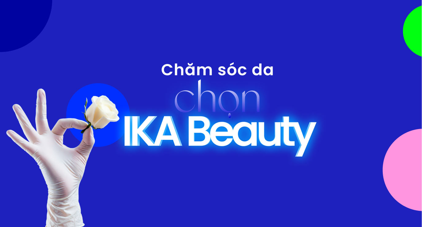 No hard selling: The visual direction did the work. I built the aesthetic to attract — not convert. The right clients came in because they recognized themselves in the brand, not because we ran promotions.
The Result: ~99% organic client return rate — tracked in-store, not estimated. I handed it over running on its own with one designer, then exited to SOVIGROUP.
 My
Insight
My
Insight
Every client message I wrote myself. AI handled the drafts; I rewrote the ones that mattered. People can tell the difference — not because the words are wrong, but because the timing feels off.
AI handles the drafts. It just doesn't know what a brand sounds like under pressure — that judgment is still mine.
- Exit
-
Sold to SOVIGROUP
Packaged full ops system & Business model
Official Post ↗ - Focus
- Smart Ops, AI Automation, Brand Vibe
- Role
- Founder, Brand Strategist, Creative Director
IKA Beauty Ecosystem
CXBOX: When studio crew coordination becomes the biggest variable in production quality, the answer is automation.
Studio shoots waste hours on repetition — same camera move, same lighting cue, again and again until the crew gets it right. I built CXBOX to solve that: one central controller that runs pre-programmed motion profiles across gimbals, focus motors, and lights. Set it once, repeat it perfectly.
- The firmware: I designed the logic, then had AI help write a custom C++ ESP32 core. It coordinates gimbals, focus, and lighting in sync — no lag, no guessing. Any motion sequence can be saved and played back exactly, take after take.
- Hardware is commodity, logic is not: Clients buy cheap local components and assemble their own units. I sell the firmware license — the part that makes it actually work. No factory, no logistics.
- Web-Serial Integration: Clients simply plug their assembled DIY devices into a PC, and the browser automatically diagnoses, flashes the firmware, and licenses the hardware instantly—no third-party software installation required. Try the live client interface at lab.vinhhk.com.
- Parallel Roadmap (The Maker Ecosystem): Parallel to the specialized cinema B2B business, my long-term roadmap focuses on nurturing a global DIY community. The CXBOX Web Lab is evolving into a decentralized "Firmware Marketplace" where developers can publish and monetize their own code. By empowering the community, we are creating a new economy where users can instantly discover and flash practical, life-enhancing firmware into their cheap local hardware.
- Deployment & Automation: Project repository is ready. Upon testing completion, the system operates almost entirely autonomously, eliminating dependency on manual human labor.
My Insight
Copy the enclosure, copy the wiring — none of that matters. The firmware is the product. That's what clients license, and that's what can't be copied in a weekend.
6 months, fully self-funded. I soldered the boards, structured the kinematics logic, and designed the web interface. No team, no deadline slippage. CXBOX works in the field — that's the only proof that counts.
- Status
- Field-Tested & Ready
- Timeline
- 6 Months (Self-Funded)
- Role
- 100% Solo Creator
CXBOX Hardware & Web Interface Architecture
24-Point Precision Anchor Architecture
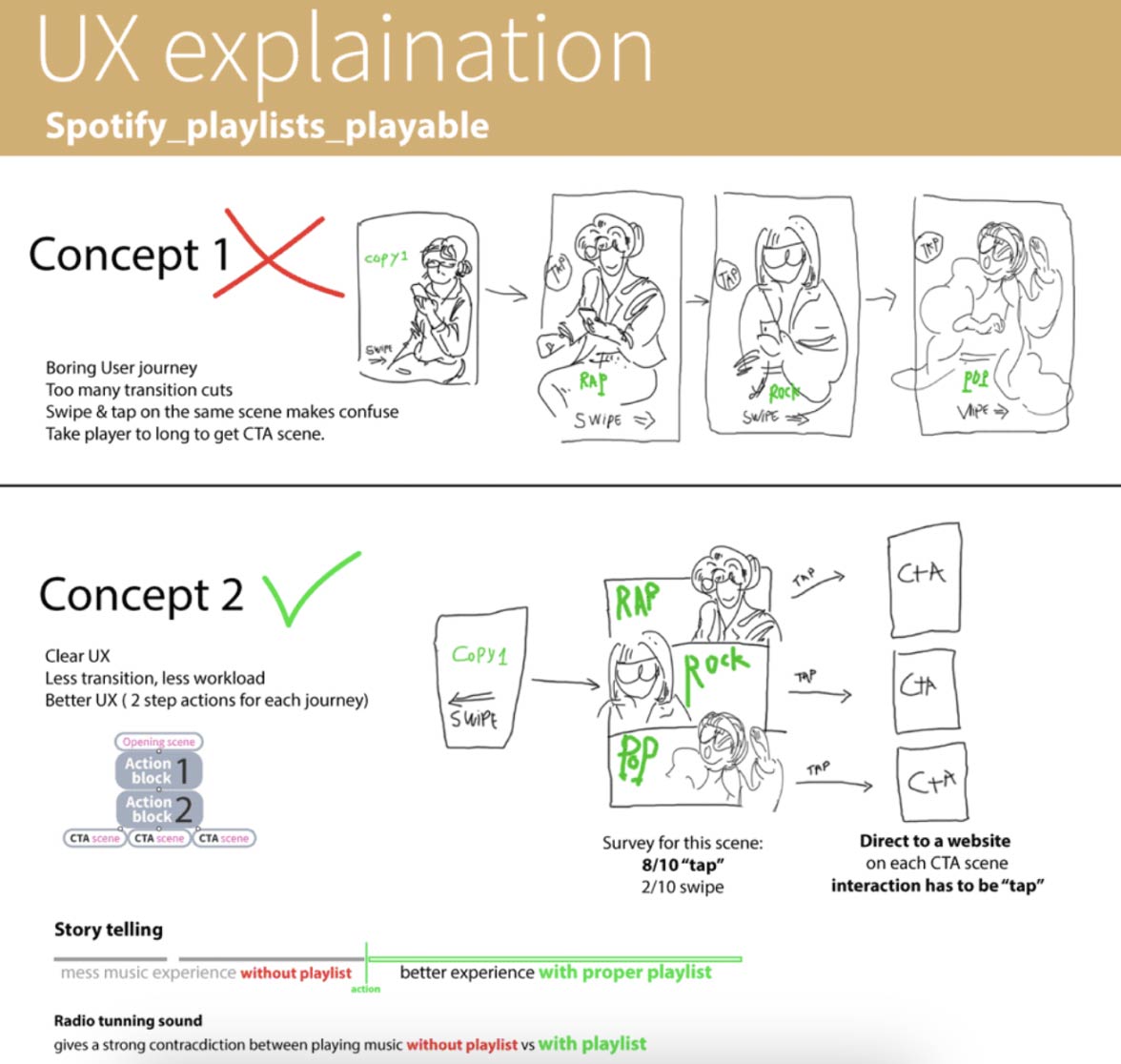
Interactive Video - Playable Development
Section: Concept art - video creative, UX, Technical Development.
Spotify wanted an ad that felt like the product itself — pick your genre, get a track. Interactive at its most direct.
My
Insight
On projects that cross art, brand, culture, and tech simultaneously — I move fast on concepts first. Rough sketches, interaction maps, feasibility checks — all before anyone writes a brief. The goal is to kill bad directions early, not after three rounds of revisions.
"Make it work, then make it right" — that's how I run the concept phase. It protects production time and keeps the final output clean.
High-volume work breaks people who rely only on taste. I've built a framework for it: treat motion exactly like rhythm, with layered timing logic. The aesthetic and the system have to operate together, or neither holds up under pressure.
KEY RESULTS
- Digital interaction
- over ~220%/ target
- Download
- 147% over target

Request me a live demo.
Spotify Interactive Campaign
I was brought in to do something else entirely — set up a design production and workflow system for their marketing operations. Task management, process structure, the kind of operational work I'd done many times before.
The reality on the ground was different. Savills runs a tightly unified global system across multiple markets, and data security isn't just a policy — in some contexts it's a hard operational constraint. The existing team, the volume of work, the way tasks were already being handed off — all of it was deeply embedded in that system. Any reform plan that didn't first become part of how they already worked wasn't going to land. It was clear early on.
The cleanest decision for both sides was to stop and step back. We agreed on that, and it was the right call.
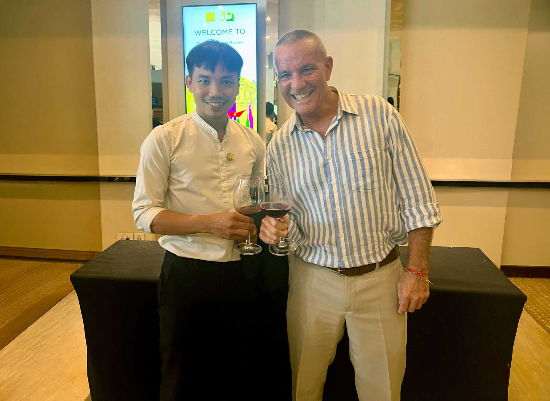
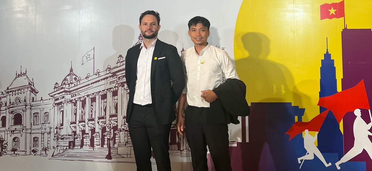
What happened next wasn't planned. The 30th anniversary project came up — outside my original scope, outside my usual domain — and my colleagues and I put real effort into it anyway. It turned into a proper case study. A good one. That's the context. The work below happened in spite of it.
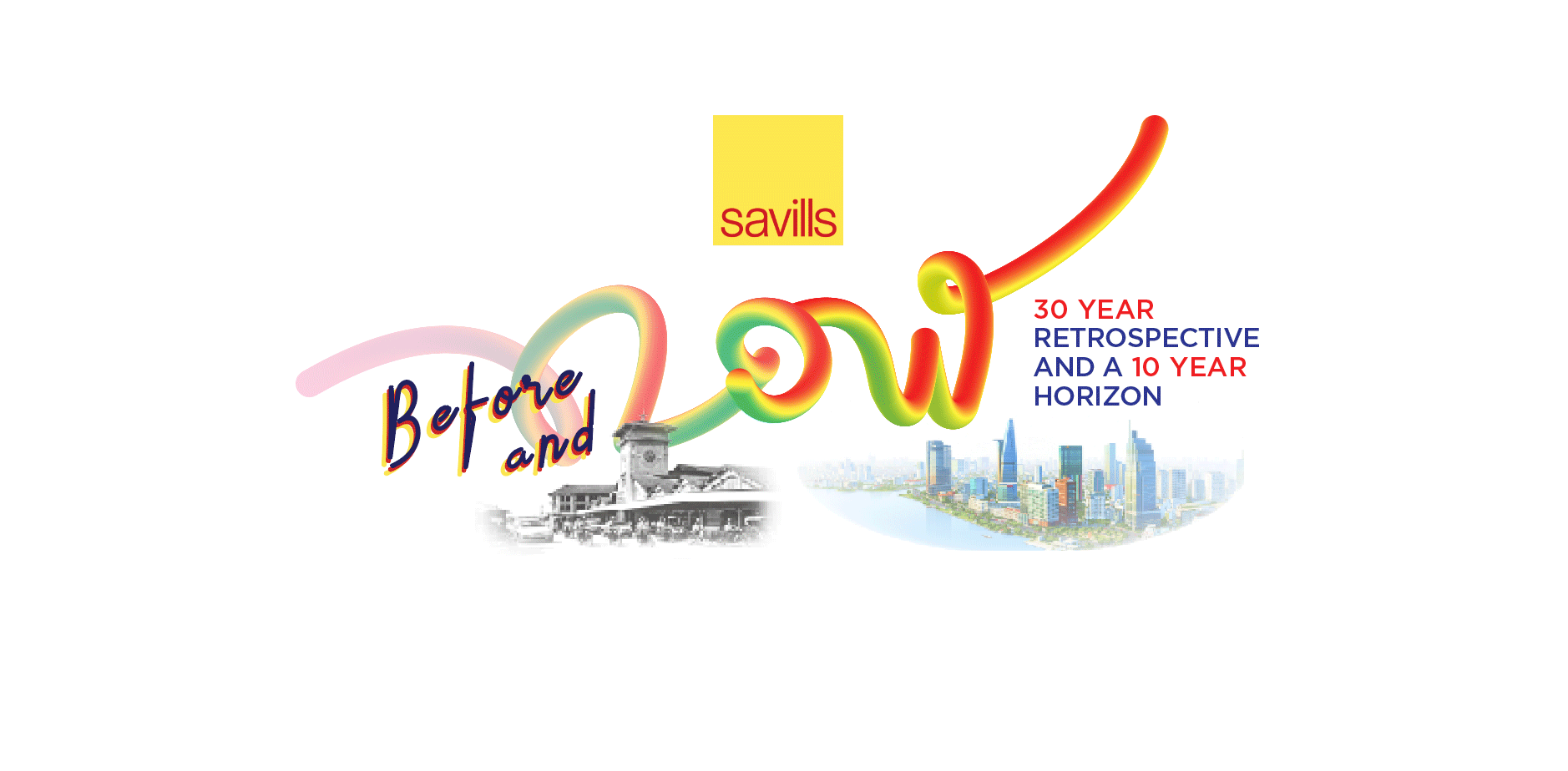
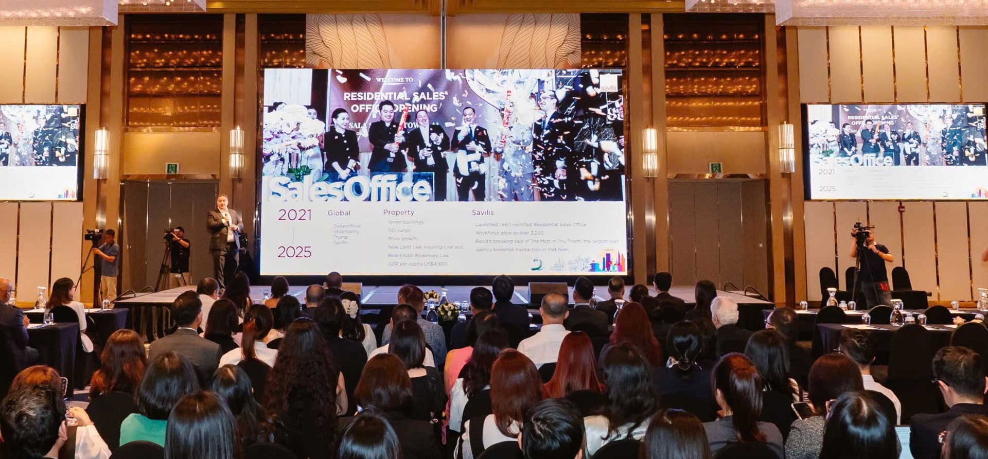
Savills 30th Anniversary - Market Review
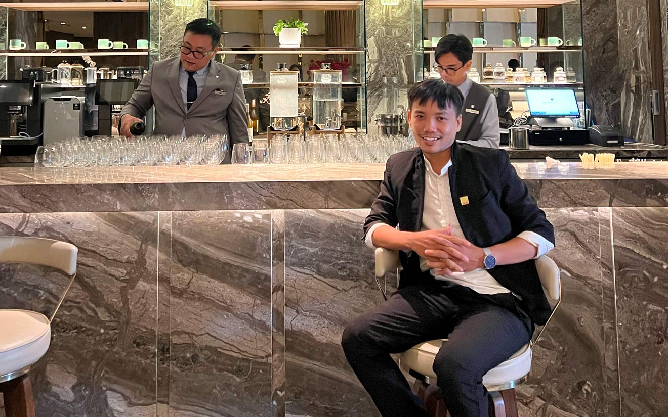
Working with Savills meant one thing: understand the room before touching the brief. Their brand has 30 years of weight behind it. My job was to translate that — not decorate it.
This wasn't my brief to begin with. But when the 30th anniversary project landed in front of us, I treated it the same way I'd treat anything I actually cared about.
No chasing a "wow moment." No expensive set pieces. I stripped the visual system down to one strong focal point and gave the rest of the space back to the people in the room — who, at a C-suite event, are the whole point.
My rule for events with 30%+ senior leadership: one anchor, clean presentations, serious hospitality. The prestige is already there — in the venue, the guest list, the suits. Stage props compete with that, they don't add to it.
- Audience
- C-Suite Executives, Major Corporations
Savills 30 Years Event Concept
Redefining Fintech Visual Language.
This project is a strategic collaboration between Trusting Social
AI and TPBank.
Below is my comprehensive logo development process, encompassing a unified design
language system - from brand identity to marketing visuals and brand voice (visual
communication) - ensuring consistency across Brand, UI/UX, and Animation.
CONCEPT: THE "E" EVOLUTION

The "e" symbol is the core identity, meticulously crafted on a precision geometric grid to ensure perfect balance and scalability.
Originating from a primitive concept of three distinct dots, the animation intuitively visualizes their convergence into the 'E' form. This efficient blend of shape and motion is designed for future scalability, allowing for lightweight conversion into code-based formats like JSON (Lottie) for seamless web-app integration.
COLOR STRATEGY
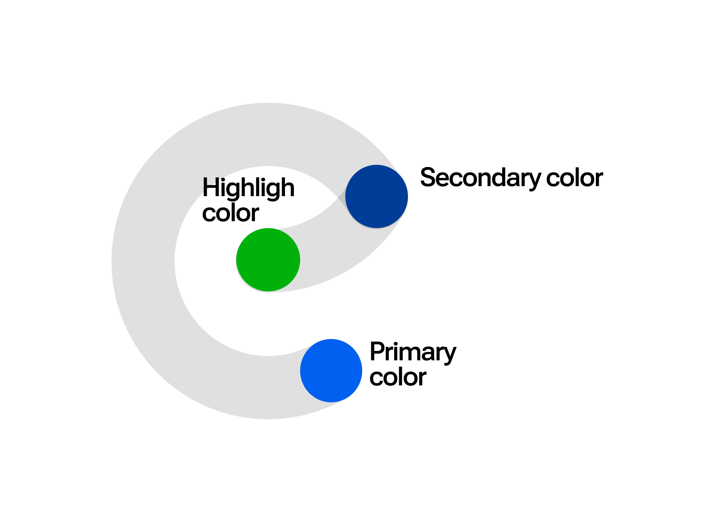
Following the 60-30-10 rule, the palette uses a deep Navy and Light Blue foundation. Secondary tones are integrated to provide visual depth, akin to the layers of a fine art painting.
Brand VISUAL & VERBAL DIRECTION
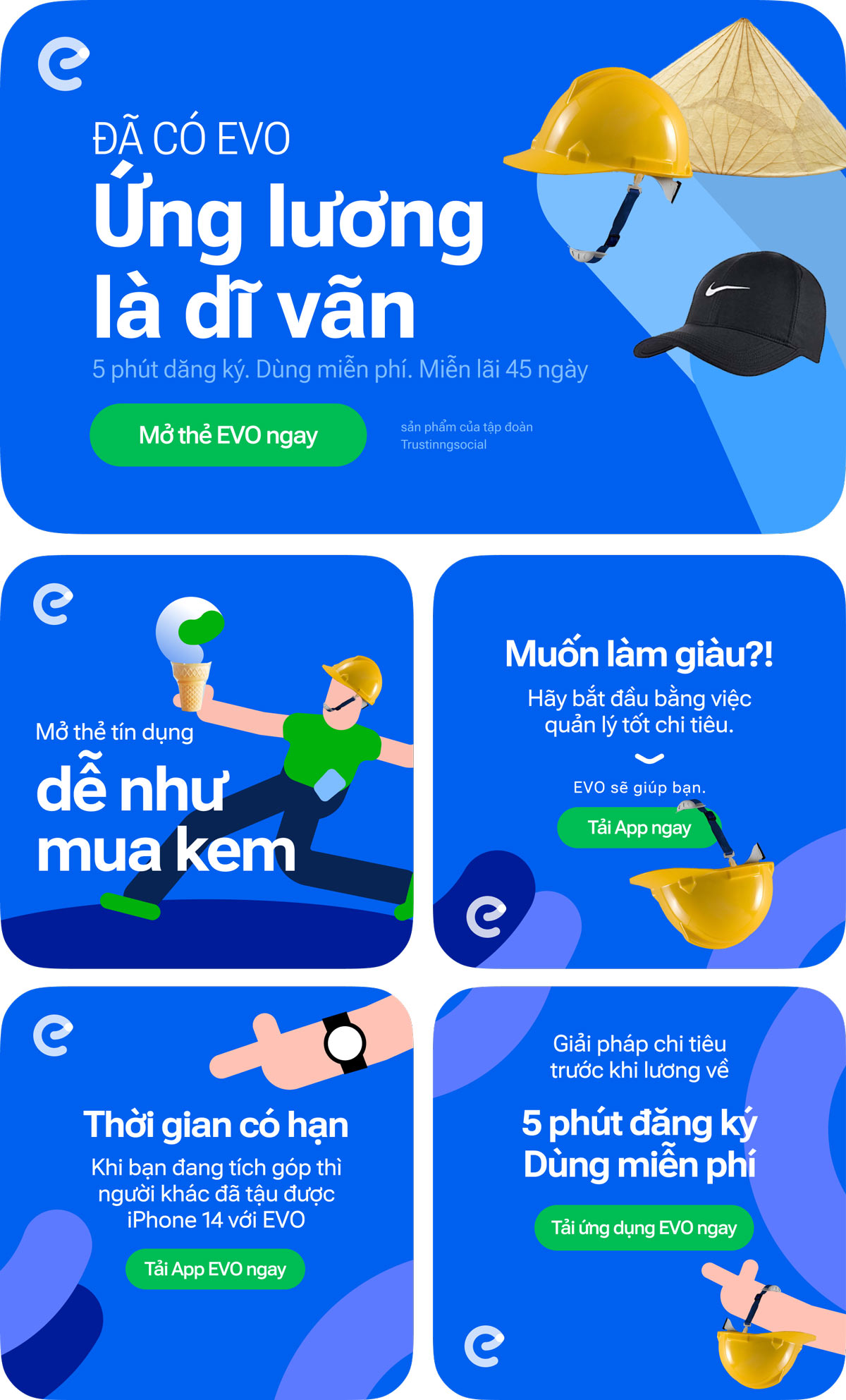
Brand shape consistency creates an unmistakable presence, ensuring distinctiveness in a crowded market. However, the visual concept is more than just aesthetics; it is a strict minimalist philosophy, derived directly from the logo’s geometry to dictate a unified brand language.
Personal tech objects serve as the visual anchor, but they also define our Copywriting Tone. We speak the language of "digital natives" - those seeking pragmatic installment solutions. Our voice is as sleek, functional, and direct as the devices they hold.
I enforced a modern, authentic creative direction to reject the sterile artificiality of traditional banking. Staged, emotionless stock imagery and robotic corporate jargon are the antitheses of the brand I created. We don't just "show" differently; we "speak" differently - humanizing finance through the intersection of cutting-edge technology and real-life relatability.
Brand Identity Showcase
Marketing Campaign (Singapore)
Project executed at Filament Agency Singapore
Brief: Customers earn free KrisFlyer miles based on their electricity consumption (kW used).
The Challenge: Developing a visual concept that effectively bridges the gap between two unrelated ideas: electricity usage and free travel miles.
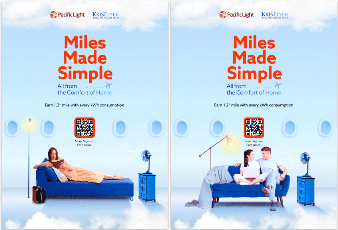
My Key Visual Solution: I proposed a concept integrating:
- Electrical appliances.
- Flight and travel imagery.
- Target Persona: Young, dynamic, modern, and high-income individuals.
- Execution: The combination required animation to create a seamless flow between these elements.
Results:
My Role & Responsibilities:
- Developed the handcrafted concept, transitioning from static Key Visual (KV) design to full Animation.
- Supervised design quality and provided creative direction to the design team.
- Managed revisions and adaptation for various assets including print materials and microsite design.
- Pitch Win: The client was delighted with the proposed direction, securing the project.
- Cost Efficiency: The production approach was optimized and feasible, saving costs for the client.
- Performance: Achieved 500 signups in just 2 weeks, with digital engagement rates exceeding expectations by 200%.
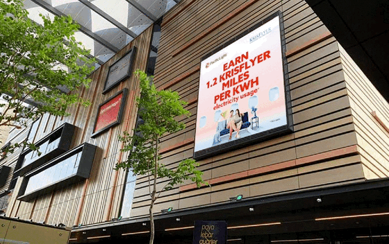

PacificLight x KrisFlyer Campaign
Performance-Driven Motion Graphics
Motion work across Tech, Fintech, FMCG, and Entertainment — built for performance, not just looks. I came up through fine arts and learned the technical side hands-on. That means I can see what's wrong in a timeline without asking someone to explain it.
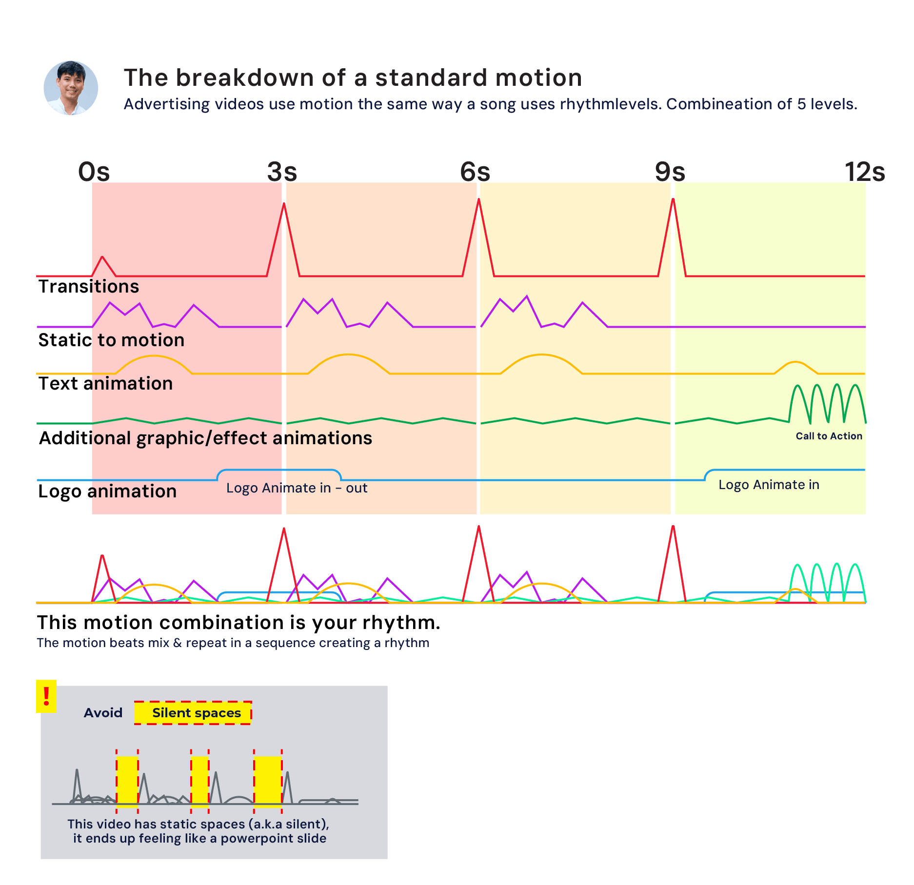
Years of campaign work taught me that motion follows the same logic as music — it's layered, timed, and structural. I run a 5-level motion framework: no dead air, no random effects, no padding. Every second earns its place.
See how it runs in practice below.
Professional Experience
6 years leading design across global agencies, AI fintech, and creative production — building operational systems, managing cross-functional teams, and delivering at scale.
 Agency (Singapore)
UI/UX Manager
Agency (Singapore)
UI/UX Manager
 AI-Bigdata
Fintech Art Director
 Creative Production
 Fintech (Vietnam)
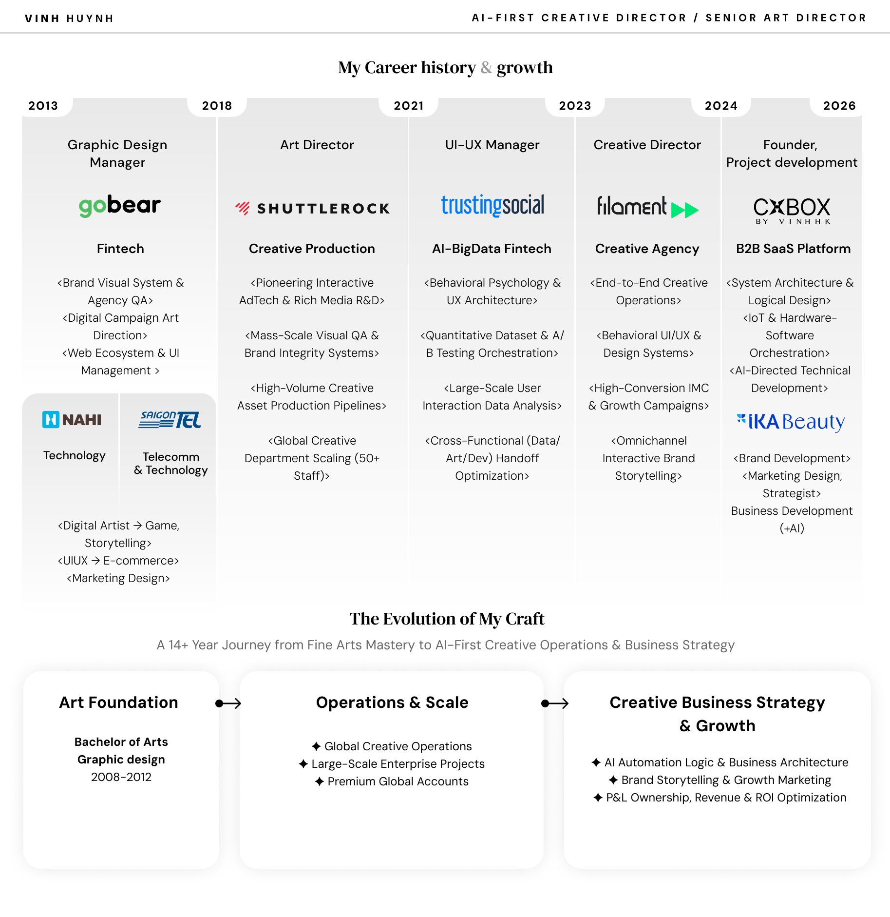
My Career Journey & Growth
14 years. Started with fine arts and hand-drawing, ended up running design teams of 50+ across global tech companies, agencies, and fintech startups. The through-line has never been the tools — it's reading what the work actually needs at each stage, and having the range to deliver it.
From B2B product design at CXBOX to scaling a 50-person production team at Shuttlerock — the work changes, the approach doesn't. I build systems that don't break under pressure, and I've been integrating Generative AI into production workflows since 2024, before most teams had a policy for it.
Brand Experience
Brands I've worked with across Gaming, Tech, E-commerce, and FMCG — from global campaigns at Shuttlerock to independent brand builds.


The Origin: Art, Science & Business
Fine arts at university (2008–2012). The habit I came away with: looking at a composition and asking why it works — not just whether it looks good.
Early on, it became clear: beautiful work that no one pays for doesn't last. That gap is what pushed me toward business.
Arts training, systems thinking, business judgment. That's the combination — still the same one I work from now.
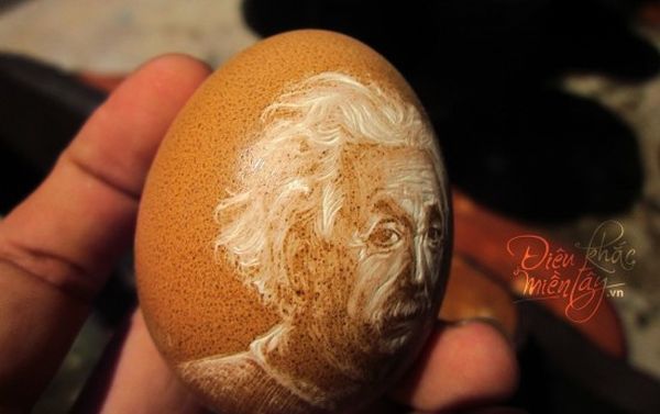
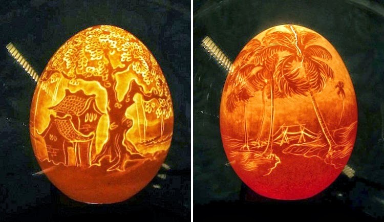
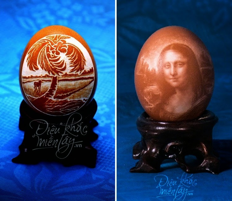
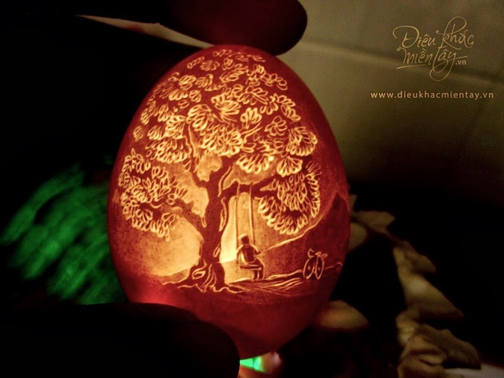
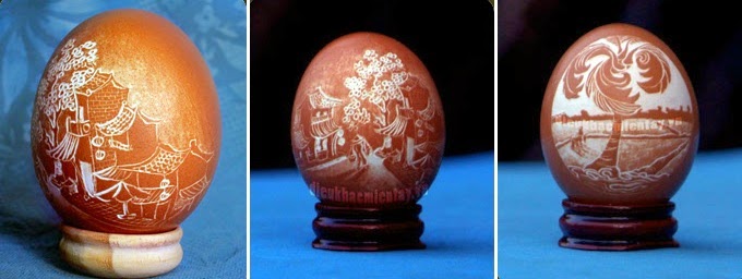
One project from that period worth mentioning: The Eggshell Project (2012–2013), "Dieukhacmientay.vn": Hyper-realistic portraits carved into eggshells with dental drills. Weeks per piece, zero margin for error. It spread internationally on its own.
I shut it down in 2013. Viral attention with no business model is a dead end. Closing it while it was still growing taught me more than continuing would have.
Digital Design & 3D Art Foundation (2014): Moving from fine arts into commercial work, I spent the first years obsessing over visual layout and product visualization. The standards I set for myself then — on render quality, composition, material accuracy — are still the ones I hold now. That period translated the hand-drawing precision directly into digital output, and it's what eventually made the jump to creative direction feel like a natural extension rather than a career change.
Early digital design work — 2014. Where the foundation was built.